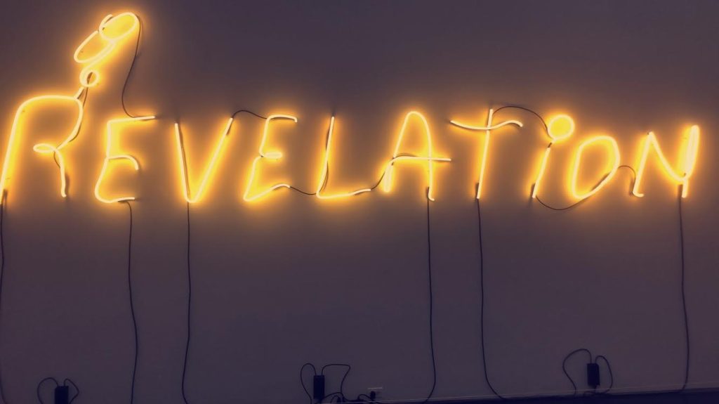
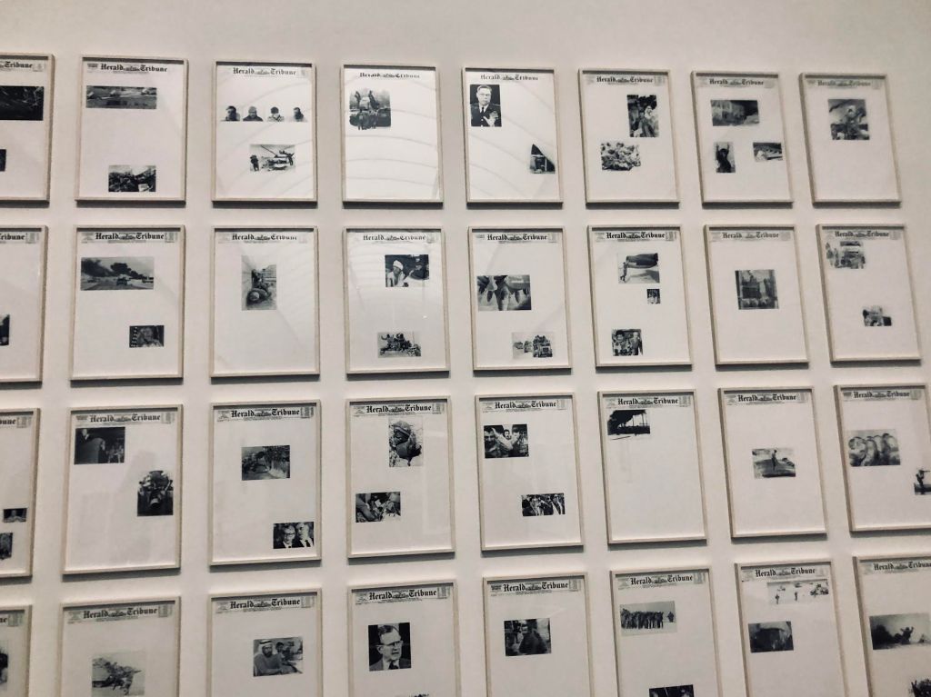
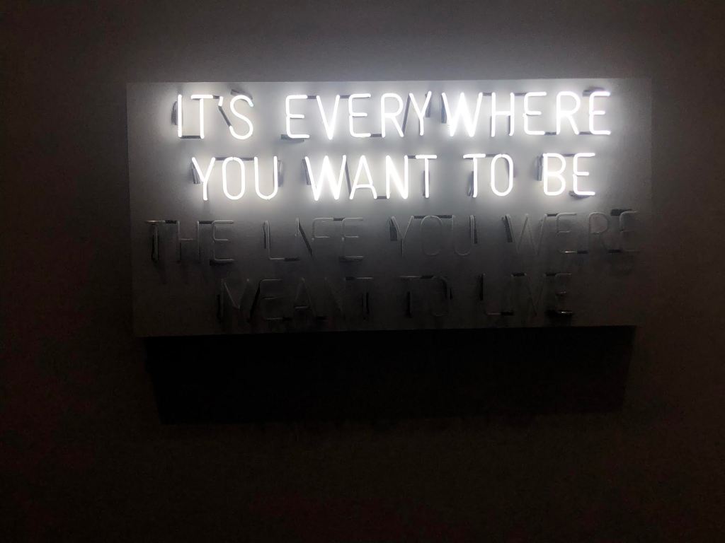
I found these three pieces particularly interesting at the museum because it make me think about typography in a different way. Type can be more than just black and white inc on a page in a book or magazine, it can be artistic. I found myself to be drawn towards the different light installations, especially ones that played around with movement. I also really liked how some artists not only use the type as a design element, but the lack of type as well. Looking at the negative spaces in articles can be just as fascinating.
